Row Headers
|
|
|
|
|
|
Row Headers |
The optional row headers are available for single- and multi-column trees. Row headers are displayed to the left of the item area, column headers and column footers and are enabled using the RowHeaders.Width property.
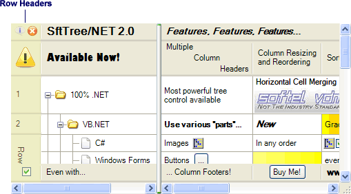
Row headers are cells that can contain parts, such as text, images, buttons, checkboxes, radiobuttons, progressbars, and more. An individual item's row header can be accessed using the ItemClass.RowHeader property. Row headers in the column header area are accessed using the Headers.RowHeaders property. Row headers in the column footer area are accessed using the Footers.RowHeaders property.
The SelectOnClick property defines whether clicking on a row header selects the item. The ShowSelection property is useful to define whether row headers reflect the item selection (ItemClass.Selected).
After adding all items, the RowHeaders.MakeOptimal method can be used to size the row header area optimally in width so that the cell contents in the row header area can be displayed without being clipped horizontally.
If a user clicks on a row header, the application receives an ItemClick or ItemDoubleClick event.